Wednesday 15 August 2012

SWASH

In amongst all the Olympic excitement I am ashamed for not publishing a single post about the new A/W 12 collections... But Swash made up of duo designers Sarah Swash and Toshio Yamanaka have certainly designed one of the most diverse and inspiring collections ignited by Olympic fever. For there A/W 2012 collection it is comprised with numerous motifs that set the guidelines and looks to pay attentions to during a colder months.

On the one hand you have numerous layers topped with playful knit hats- not missing pom-poms! Paradoxically paired with a reminiscent pre-summer floral vibe, soft pastels upon silk, finished off with cable knit jumpers. Allowing for some high-waisted shorts to be worn, as long as you have a thick jumper to keep you warm.
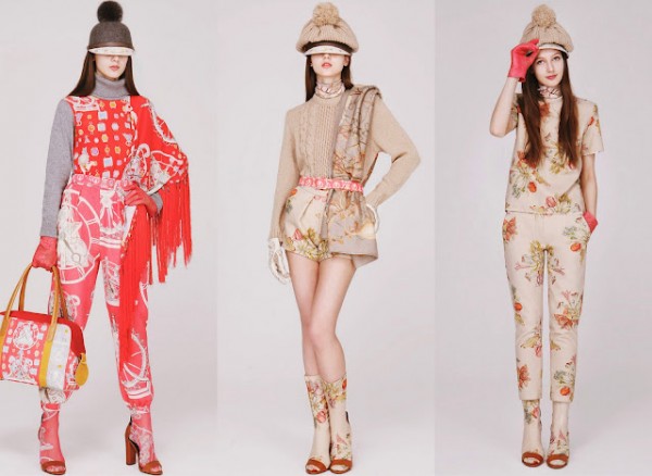

Heritage plays a significant part this A/W collection with dark framed diamond shaped prints, followed uniquely by a talisman motif that is recurrent from this label.


These beautiful tones of blue show homage to the seasons colour, a spectrum from teal to blackcurrant. They certainly haven't lost interest in there accessories with printed rimmed hats and finished off with leather gloves.
It would certainly be hard to find an element of next seasons hypes that Swash have missed! The repeated motif appearing on scarfs to cushion covers show the extent to which the print can be used and rotated into various dimensions.

The gothic is focused highlighted and dramatised with tight leggings and fringing. Various styles and layers are juxtaposed with this chain imagery across the black fabric.
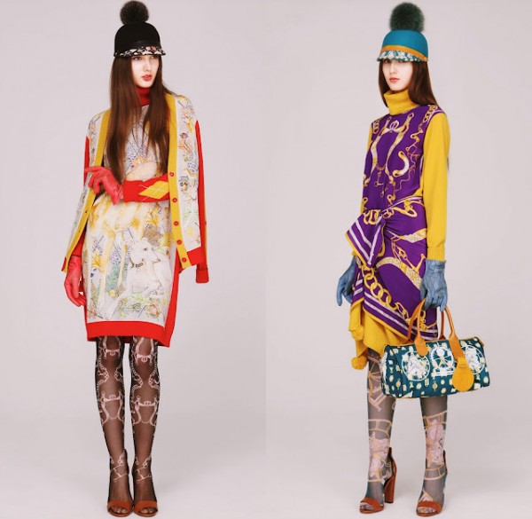
Fairytale esk sketches outlined with cherry red and warm mustard yellow, whats not to like!! This collection has ignited my longing to start university in September specialising on fashion for print, when a collection is executed as stunningly as this.

Monday 2 July 2012

Bernhard Willhelm menswear s/s13


Perhaps its the ongoing longing for the sun to reach the pinnacle of yorkshire rather than the temperature rarely rising above 13 degrees... But this stunning collection is something that not only embraces the sun but reaches out to all cultures universally. To see a creature dressed in these spectacular garments would not only make my year but change the typical image of menswear.
In most cases it appears that in relation to the colour pallette, menswear sometimes has the tendency to hold back with the clashing prints rather than embracing the symmetry it creates as one layer of digitalized print is layered upon or wrapped around another.

The kaleidoscope loosly fitted jacket and matching hareem trousers a perfect ice-cream mix of shades with a splash of blackcurrent edged shapes.. could we ask for anymore? The contrasting gold-leaf fur effect encases the jacket like a second skin. Held up by and wrapped by offensive duck-tape allows the other concept of the collection to be questioned the distinction between life and death presented with added tribal-esk make-up and white face paint.


Yet Willhelm fully ermerges himself into embracing and challenging the contemporary question of print, with a mixture of intricate pastel shade prints juxtaposed with striking black out-lined hot pink pallette. The loosly exaggerated silhouette is created with the fabric portraying the laid-back luxe impression. Chords appear loosly hanging of the garments or as with the photograph above a small thin wire belt around the middle.


Imagery of life and death seem to be mirroed by the use of materials, the question seems to be thrust apon us about baracading the figure with colour whether it stands as another form of protection.. this is enhanced by conceptual ideaology of the collection and the anniversary of Bernhard Willhelm's lablel.

Saturday 26 May 2012

Niky Roehreke

My fascination for illustration has increased immensely and the relationship between illustration and fashion design I believe is vital not only in an obvious sense to 'illustrate' and communicate ideas between the artist and the audience but to portray a certain element of emotional grandeur.
For fashion it is not necessarily about honing as much obscure detail in the figure beholding the garment but focusing upon how to demonstrate a certain material and its unique texture and sculptural qualities.
The story behind this German/Japanese illustrator is not only heart warming reaching out to shy and somewhat introverted individuals seeking a way to relieve anxiety through art, yet unique. Her focus upon hands as a ulterior motif as they communicate with others and hold 'special qualities' is something she feels is important. All her illustrations feature hands as a reoccurring theme, they are 'a goal, something rare'. Roehreke's use of mixed media allows her illustrations to become 3D distancing her from other fashion illustrators who predominantly use watercolour and ink as a solid base for there design.


Its safe to say that I will never use one medium to produce my fashion illustrations again! Utterly beautiful. 

Friday 25 May 2012

Issey Miyake

Will July please hurry up!.. After seeing a short taster of Miyake's designs through an oriental fashion film by Alex Sainsbury, it would be an understatement to say I didn't worship the ground that he walked on. It is not only the concept that is enthralling but his continuous passion to collaborate with high-tech science to produce the most diverse and controversial designs. After he was initially inspired from a subtle handkerchief crease he has transformed and changed the perception of the industry's knowledge of pleats.
Launching the Miyake Design Studio in 1970, allowed the freedom to produce dynamic garments that contain a physical ambiguity creating a dialogue between clothing and the underlying body.

   'Once it's made, fabric is like the grain in wood, you can't go against it. You know what I like to do sometimes? I like to close my eyes and let the fabric tell me what to do.'

Issey Miyake began to manipulate pleated textiles from 1988 but the official Pleats Please exposition was not until 1993. He has influenced a large number of designers to pursue this aesthetic and adapt it to there unique designs, such as Naoki Takizawa. His work has conserved Miyake's career-long focus on a typical forms and transforming shapes through applications to advanced textiles.

Oh dear I could talk for hours about this designer but really the images speak for themselves...


JULY 2012 Miyake studio's launch Pleats Please' latest Publication


Thursday 24 May 2012

A Lab Milano S/S 2012


This garment is extremely placid in comparison to the
rest of the collection, yet counterbalances the impression
first glance very minimal tailoring. Paradoxally, when
one focuses upon the garment the cut out sections in the
top allow for a high collar to become pronounced and for
the arms to appear longer and demand for the eye to travel
down the garment. The sheer fluidity of the floor-length
skirt is a perfect finish with varying thin pleats increasing
in size, yet narrowing down the garment. The look overall
further connects with this theme of the Amazon, represen-
ting the river that flows un-noticed between the trepidation
forest either side.

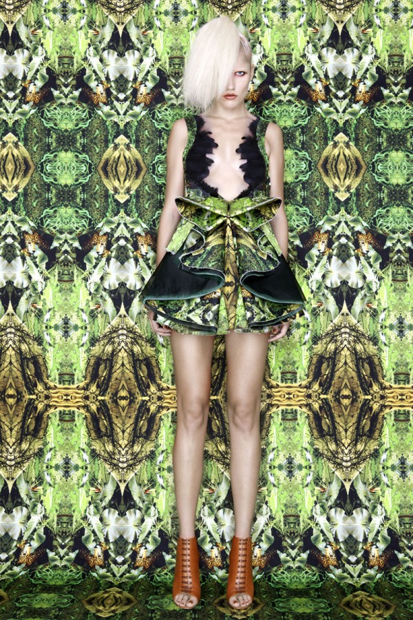
I have to admit prints are a serious weakness of mine, hence when I discovered A Lab's most recent collection my heart melted. The collection is all about portraying the wild habitat of the Amazon. They emphasise the earthy nature and grit that we associate with the foliage combined with the deep acid colours and striking edges and tailoring which communicate the intensity of the tropical heat. The focus is not solely print based, the structural garments enhance the impact of the collection.. folded palm leaves create the edges of a symmetrical skirt.
                                                                  
The sharp tailoring defining the neck travels down the blazer, colliding with fiery flowers flaring from the cuffs and bottom of the garment. The shorts subtly merging with the prints, the palette is predominantly orange and this sets the tone off with the laced toe poking heels providing the dramatic finish.

Friday 18 May 2012

Alice McCall

Alice McCall is a new designer to me, but what struck me about the Australian designers recent collection is how she has unconsciously being inspired by various other designers. Maybe this is because of her amazing work experience catalogue; styling for MTV for 2 years, then for Natalie Imbruglia for Dazed and Confused Magazine with photographer Rankin. As a freelance personal stylist for numerous celebrities has probably what attributed to her success, working with the likes of Blondie, Kelis and Destiny's Child as well as international campaigns for Nike, Levi's and Rimmel.

After being head hunted by Buddhist Punk to design a women's collection which appeared in the windows at Liberty's causing a demand worldwide. She has worked on numerous collections at London Fashion week until 2004 when she flew back to Australia to launch her new Alice McCall label at Australian Fashion week.

    The label,
                  'which combines elements of tender girlish charm and bohemian flare all mixed up with a bit of rock and roll, has garnered devotees around the world.'


Remind you very much of Christopher Kane's S/S 12 collection? But I love how she has captured the Russian Doll aesthetic. Keeping very much to her trademark style with sheer silk dresses featuring bright floral embroidery combined with fine cut edges. The basis of the palette was white, yet layered with neon colours fuchsia, tangerine, acid yellow and sky blue.


Louis Vuitton S/S 12? This laser cut baby blue garment is reminiscent of the looks we were seeing a few months ago, but there is a stunning pattern comprised in this garment with loose pleats from above the waist line. This typical tea-dress shape has being reinvented with a sharp crew neck and absent sleeves, combined with a signature pentagon circular shape cut-out of the chest.

One thing that is prominent this season is nude shoes, they have definitely made a statement, from clogs, loafers or court heels it has been a regular feature on the runway. To be honest it is about time too, they are a fail safe with most garments and finish of a look subtly.


Wednesday 16 May 2012

Introducing...

Hellooo, my first blog was my application to Manchester University for Fashion design.. So technically this is my first ever official post as me. This is something that I have been intending to do for months, but as ever my Foundation course at Leeds Art college has demanded my attention.

But where there is an end, most upsetting saying goodbye to Leeds and some of the most lovely friends, other doors open to  London -Rochester University of the Arts to study a unique course for me Fashion Design: for print. It will not just be studying a random degree, its my passion, something that defines me.

A little taster of my final garments for my foundation final major project, the direction I have focused upon was draping and the impact upon the silhouette-


Inspiration for the styling of this shoot came from Chanel's recent catwalk show A/W 12-13, my interpretation was with pearls rather than jewels to emphasise the pale impression in the shoot.


Sarah Burton for McQueen this season created a dramatic effect with there extremely textured collection, layers drawn in at the waist with sculptured silver belts, cascading pleats beneath and tiered lengths. Minimal attention for make-up, frosty hair adds to the snowqueen imagery. A dream. They may be the most universally recognised labels, but the work that goes into each season is phenomenal. I would give my right arm to sew a small pearl to any of there garments...

Ta ta for now xx